One and Two Cardigans

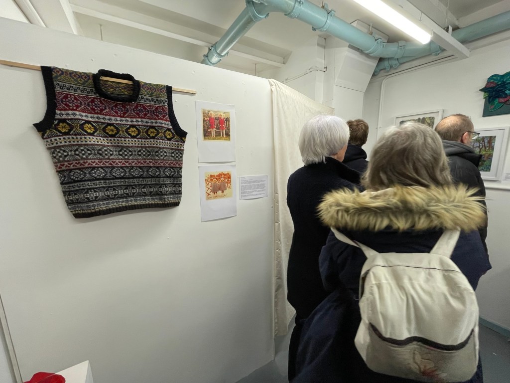
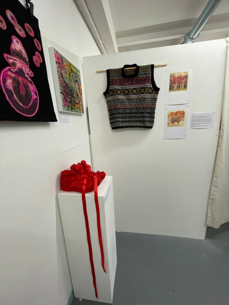
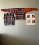
One and Two Cardigan’s, After Kosuth’s One and Three Chairs.

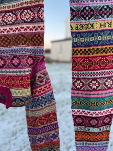
I finally saved enough money to have a perfect box frame made for the first and only yoke cardigan that I have ever made, way back in 2015.  I was never happy with the results, and hardly wore it.  The project was a learning curve of both knitting/ textile construction, steeking and colour work as well as my first taste of Shetland from my visit to Shetland wool week that year almost 10 years ago. After making it, the cardigan mostly lay dormant in my bottom draw for some years and I have, on many occasions, almost given it away.   

My reason for boxing it, is not sentimental but the fact that, unbeknown to me,  Francoise Delot- Rolando, a French artist,  painted the very same cardigan in her โ€˜Clothing Fragments Series,โ€™ in late 2021 and in March 2022, she messaged me asking if she could post the image on her Instagram of the little painted mustard cardigan.  I had no idea what it would look like so she sent me images, which absolutely blew me away.  In March 2022, she generously sent me the little exquisite painting, framed in a French biscuit tin. It arrived when I was living for one week, in a borrowed house, six months after returning from Shetland, when I was moving from pillar to post without home or idea of home and I was very lost. Here is the post of that time https://traceydoxey.com/2022/04/12/tin-paint-paper-creative-generosity-and-kindness/

When the painting arrived, it took my breath away, made me feel connected to a woman I have never met, connected to her art, to my knitting, to living and creating work again.  She lifted my spirits in a very difficult time and I have always been grateful for her spontaneous, incredible generosity.   Her gift also elevated my knitted piece from a rugged cardigan in the bottom of a drawer to something to celebrate โ€“ a journey โ€“ a life. 

When I framed the cardigan, I sent an image to Francoise and she said that โ€˜thereโ€™s something of Joseph Kosuthโ€™s, One and Three Chairs, about it.โ€™  I hadnโ€™t heard of the work, so I, of course, immediately googled it.  

Joseph Kosuthโ€™s โ€˜One and Three Chairsโ€™ was a conceptual piece from 1965 โ€“ the work consisted of a Chair, A Photograph of that Chair, and a printed text definition of the word โ€˜Chairโ€™

Every time Kosuth, showed the work, he used a chair from the place of exhibition, so the work remained the same but different each time, with only 2 elements of the piece remaining consistent โ€“ the text of the definition, and the subject matter โ€“ a Chair.  Kosuthโ€™s concern was the difference between a concept and its mode of presentation.  He unified concept and realisation.   The value of the piece was rooted in concept rather than the workโ€™s physical / material properties.   Whereas, I have come about my combined piece the opposite way around โ€“ this coupling of the painting of my cardigan and knitted cardigan sits, not as concept โ€“ but as materiality and I suppose, womenโ€™s work.    One and Three chairs explored the idea of the nature of representation โ€“ same chair three ways. And in some ways, my piece could now be โ€˜One and Two cardigansโ€™ but for me, it also raises the question that I return to repeatedly โ€“ the notion of what art is and what it should be.   I placed the two works together and was introduced to an Artist I hadnโ€™t heard of before as reference to a similar representation.

I have long wanted to box frame the cardigan to sit alongside the painting of it but why elevate the old cardigan? Itโ€™s rough around the edges, its yoke colours jar with me now and all I see is how I would knit it now, how I would do better.  Letโ€™s be honest, without the beautiful painting, it would not have been a consideration for me to frame this knitted piece.  At one time, I would have framed it as a sentimental reminder of my growth in learning a craft involving my love of Shetland, my first experiments with steeking (knitting in the round then cutting the piece open up the front to create an opening) such love and attention to the hand made buttons, such attention to its making would have at one time been a reason for me to frame it โ€“ but not now.  There was no romance in framing this piece, it is ART when placed alongside the painting, it is something more than itself.

I have finally placed it on the hand printed wallpaper that Emma did for me in Shetland โ€“ a Peggy Angus print from long ago.   Emma told me that the wallpaper was made to show art โ€“ but I always loved the paper too much to cover it โ€“ now โ€˜One and Two Cardigansโ€™ sits on top of a small area of beautiful paper, elevating it even more.  Not everyone would see it this way, but I do.  The small details in life are what I live by, and then life becomes that beautiful small moment.  The small things count.

I invite you to consider this  – is my newly framed old cardigan, when framed and placed next to an oil painting of the very same cardigan, is it art? 

Is there a concept of knitting as art? Or is it a Textile artistโ€™s work?   Kosuth focused on the idea of a chair rather than its physical representation, and now, I too have focused on the idea of The Knitted Cardigan.

Happy new 2025. 

Hoping for a year of creativity and small sharp points of beauty. xxx

outdoor knitting

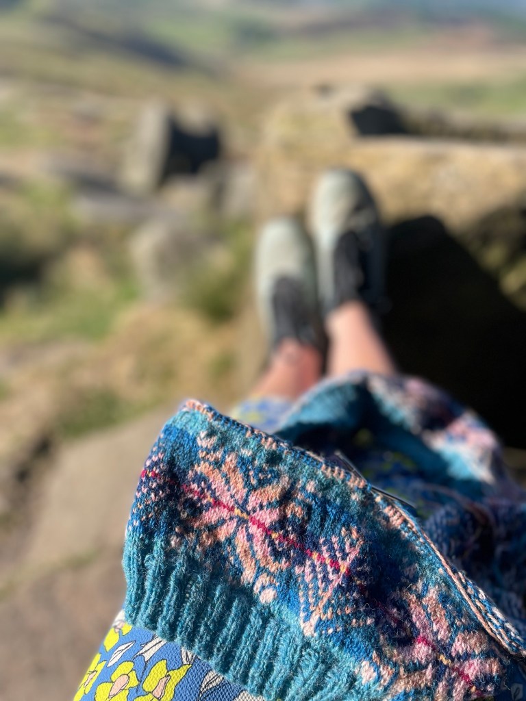
In celebration of knitting outside for one year, for moving around the sun for another 12 months outside knitting, I wonder if I am filling time, or am I connecting to self? Why spend all these hours knitting and walking and sitting outside when there could be something better to do with my life. I saw a post yesterday, where Julia Roberts learned to knit on set and looked at a length of knitting as ‘lonely time’ It made me wonder.

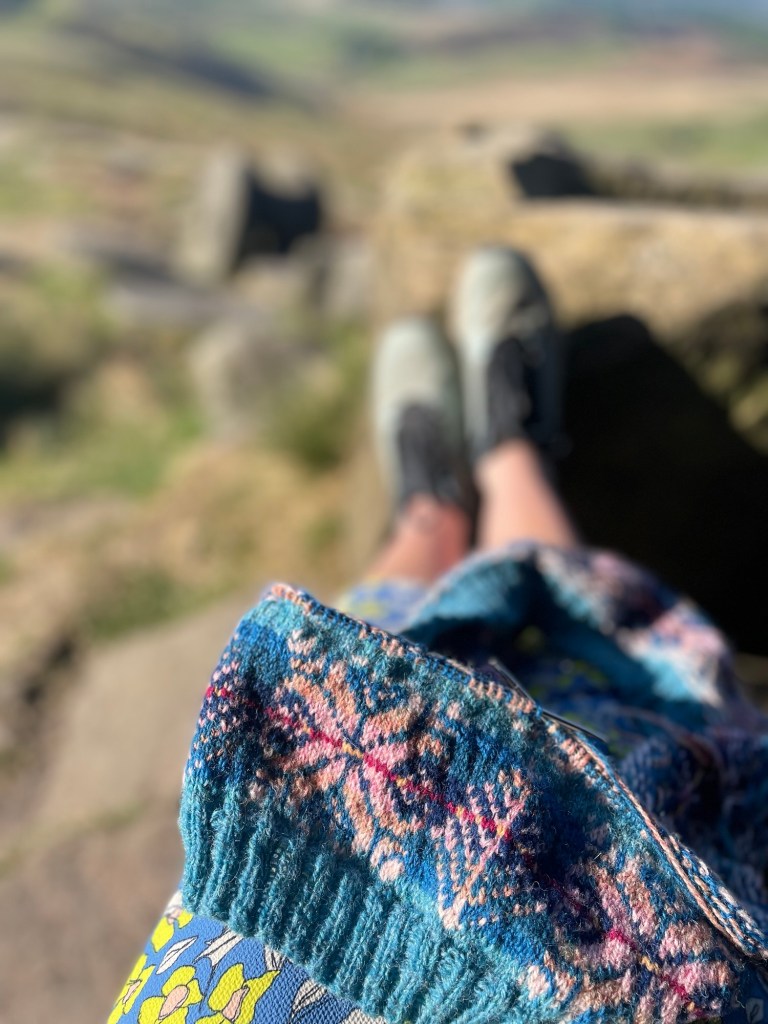
Because I feel, completely calm and peaceful in my outdoor surroundings from the time of knitting temples of Kyoto one year ago this week, to knitting at my favourite place beside ancient abandoned millstones at Stanage Edge, or beside the work of Lee Ufan in the Summer Garden exhibition in the Rijksmuseum, to the simplicity of an early evening walk from my home in the city, through the allotments, beside the stream to wait for the King Fisher and knit โ€“ watching the sky change colour. Just sitting quietly and knitting. Am I filling time?

Could I be doing something better with my life other than working with my hands, creating art, out in nature, connecting to self, waiting for that one pure moment of natural beauty whilst knitting?ย  I have realised that all of these times have given me peace. I am not sure what could come close to that total peaceful time? maybe in the arms or a partner but failing that – I rely on myself to find the peace.

Happy Wintering. Peaceful moments in this time of world uncertainty.

If you would like to join me in my online colour work knitting workshop, then please go here , I have a few places left in January. And if you would like to join me for a 1:1 workshop, then please get in touch – I could take you out knitting in the wilds of the local area.

https://www.ravelry.com/designers/tracey-doxey

New easy pattern – Little Kisses Mitts

After visiting Amsterdam,ย  I have made a new little knitting pattern, which I started knitting and designing in the garden of the Rijksmuseaum ย and finished on the Eurostar back to London. ย Then I had to do the difficulty of writing the pattern out, getting it checked and test knitted.

But, here it is, ย Iโ€™ve made a new Little Kisses Mitts pattern โ€“ the left mitt was knitted using greens inspired by the the garden against the pebble colour of Lee Ufan’s stones in the summer garden exhibition in the Rijksmuseum, in Amsterdam.ย  Then knitted a matching mitt to the green one but using berry colours – Cherry and Raspberry. ย  This pattern is a very easy knit using a cute peerie Shetland motif, which looks like little hearts in boxes โ€“ which is how I finally came to choose its name –ย ย  Little Kisses Mitts.ย 

The motif is very easy. It is only made up of 6 stitches and 6 rows, so, when you have set up the first round, you will not have to look at the chart again until the round to insert your thumbs.

The thumb is easy to knit. I have added clear written instruction and photo tutorial to take you through all the stages to produce neat little thumbs in your mitts.ย  There is also a little reel on Instagram which shows all the stages too โ€“ it is here. https://www.instagram.com/reel/DBtwzO4IUen/ go to the link to see the clip of knitting the thumb.

Little Kisses Mitts, Pattern uses 3 listed 4ply colours from Jamiesons of Shetland but you can knit it in 2 colours or as many colours as you would like to use from your stash. Itโ€™s a very quick and joyful knit with endless colour possibilities.ย ย  I knitted the both mitts in Jamiesonโ€™s of Shetland, Spindrift. In Pebble, Moorgrass and Mermaid โ€“ then in Berry colours using Dewdrop, Cherry and Raspberry.

You can also use JC Rennie Scottish Supersoft Lambswool 4ply which I also used after buying a lovely large ball of aqua colour in Amsterdam.

I have used 3 colours in each of my knitted examples, in order to make the knit reasonably priced – rather than the patterns that I have been knitting recently, which have grown in the amount of colours used in them.

The pattern is here ย ย ย 

Ravelry: Little Kisses Mitts pattern by Tracey Doxey

As always, thanks to Karen Barker for her brilliant checking of all of my details written in my pattern and to Gary Butler for knitting the mitt and giving advice on the pattern notes. ย ย Your support is much appreciated

I would love to know what you think of using this tiny little motif in this easy pattern.

travel far or close up?

Is it true, that the longer we live, the more appreciative we become of the small things closer to home?

Such as the simplicity of setting off from home spontaneously on early evening walk, after teaching, just as the sun is setting far away, where the exquisite but simple chrysanthemums glow in the pink evening light in an allotment, or how the trees cover me in the woods but do not touch each other, and where I walk in an absolute carpet of leaves for miles while the sound of ever present moving water in the over flowing brook accompanies me. A change in 10 minutes from dusk to dark where I noticed every fleeting detail.

And yet, last week, at this time, I was in Amsterdam in the Oude Kerk (dating back to 1200) looking at, gently touching and enjoying beyond all understanding the hand painted linen walls in the Marriage Banns room dating back to 1760. It is called wallpaper but it is linen painted in the finest aqua, duck egg colour overlayed with exotic tulips, chrysanthemums and nasturtium.

These two moments, a time spent walking close to home through a wood at sunset, in the city and finding the blue lined walls in the oldest Church in Amsterdam, affected me in the very same way. A connection to absolute unexpected beauty.

so many things in Amsterdam affected me through the senses of sight and wonder – here are a few.

miss nothing. find joy in small unexpected things as well as the grander wonders of the world.

https://www.instagram.com/traceydoxey/

Sister Fair Isle Pullover roadmap.

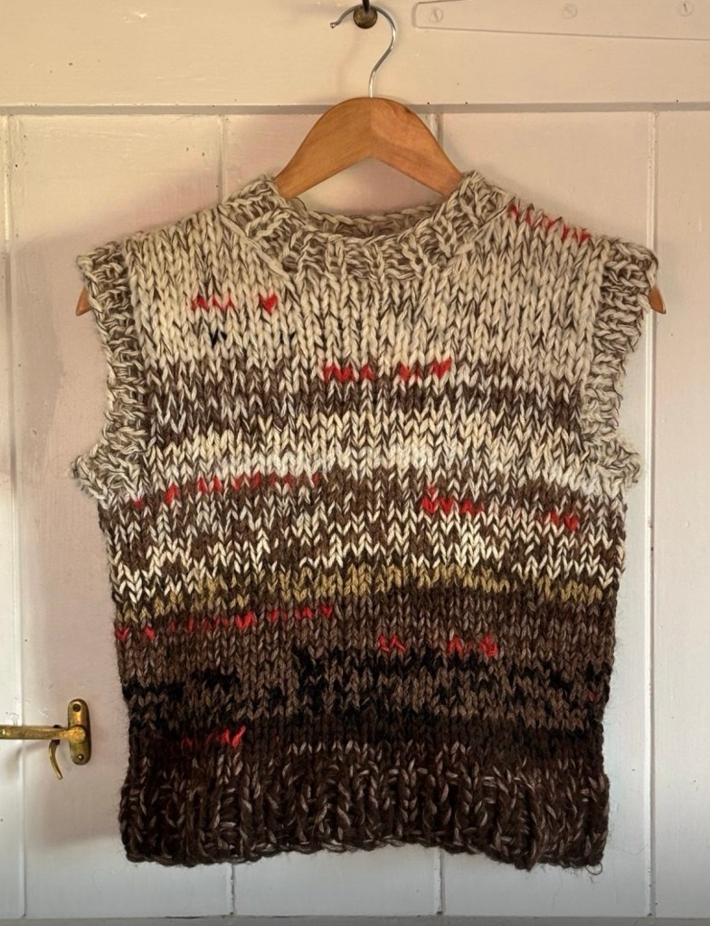
This week, I finished my 2nd Fair Isle Pullover worksheet to make a vest for my sister. The finished vest, has been made for and about my sister, in that she chose the colours and she did not want arms. These decisions, as well as others, set the vest apart from my jumper, which uses 100 colours. I am now interested in exhibiting the two knits, side by side, as a piece called – I cannot Reach You.

Below are some of the instructions in the worksheet, which is easy to adapt into your own signature story in knitting.

Included in this worksheet, are 2, A4 sized complete, full colour charts used in my pullover / vest. Chart 1, is my full body chart and the sleeve is chart 2. All of the, (more than) 90 colours that I used in this jumper are listed. I am giving you the tools to make your own road map for your own vest or pullover, or scarf, or hat.


You can incorporate any of these 11 large Fair Isle OXO motifs and 12 peerie motifs into any of your own projects and use any colours that you have or even just use 2 colours.


The 190 row pattern charts, knitted in multiples of 24 stitch repeats, included in this work sheet, is not a jumper pattern, nor a vest pattern. What I have produced is a worksheet including the entire range of Fair Isle OXO
motif bands that I have knitted. I have built them into 2 large full charts with a clear centre stitch line marked so that you too, can either replicate my jumper entirely, or move the patterns and colours around to your own taste. One sleeve of my project is knitted in traditional OXO Fair Isle patterns โ€“ the other is
knitted using Aran twisting, following how I sometimes braid in my hair in French plaits. I have been asked many times, why I knitted an aran sleeve – why not? and people often have their opions on this sleeve, which is fine, but it is my knit and anyone can knit however they choose to – You don’t have to stick to EVERY rule. I have not included the Aran sleeve charts in this worksheet but the neck aran pattern is included.


The motifs and colours within this worksheet, are a treasure trove of endless possibilities for you to be creative and make your own vest or pullover by incorporating them into your own favourite vest or jumper pattern. Use any colours that you have, use any wool that you have, use 2 colours, or like me, use over 90 colours in your jumper. In the vest I used 9 colours. I am giving you a recipe for you to enjoy and work with in whatever way you want. I am giving you the tools and the freedom to make your own design. This is more than a pattern bank, I lay out how the patterns are aligned. I also explain the importance of a centre alignment.


Recently, I have been reminded of how Kaffe Fassett, in the 80โ€™s made beautiful patterns in books and wrote, โ€˜ choose 9 balls of varied light colours and 9 balls of dark coloursโ€™ and people ran with that, me included. Sometimes, he would write โ€“ use double knitting yarn, sometimes he listed the yarn and the
exact colours. This worksheet is similar. It gives you all of the tools to knit your own beautiful projects and to be free with your own decisions. It gives you the chance to grow in your own understanding of your knitted projects.


I would love to see them on Instagram.
My jumper is knitted in Jamiesonโ€™s of Shetland spindrift using โ€“ some small lengths, some longer. These colours I have had left over from previous projects or workshops or designs. I just worked them together and alongside each other. I did swatch some colours to check how they worked, and I do recommend that
you do that too. As my colour choices are not often repeated in this project, not great lengths of yarn for each motif are required. But you can knit your own project differently.

Use your stash or buy just 4 colours or even 2. The choices and permutations are endless but this relies on you. It relies on being excited to try this idea and to develop your ideas. The project requires you to use your own favourite
jumper or vest pattern and figure out the centre front (which in my case, mirrored my centre back) and I knitted multiples of 24 stitch pattern to fit my size. Make sure that your motif bands align with the centre front. I have
made this easy for you by outlining the centre front line. Developing your sense of colour is achieved by enjoying colour, swatching to experiment for colour combinations.


It took me nearly one year to design and make this jumper โ€“ it took me 3 full days to map out all of pattern repeats in the motif bands and to chart every stitch used in the body and in the sleeve of my own knitting project that so many people wanted a pattern for. It has taken 2 more days to pull it together here. It took me a lot less time to knit the vest.


I knitted my jumper and the vest, in the round up until the arm holes, then I split it and worked on the front and back separately but at the same time so that I used the same colours. Make sure that the centre front stitch is the right one so that the motifs bands align above each other. In the chart, stitch 12 (out of the 24) is the centre stitch of the first large OXO motif. The charts are in multiples of 24 stitches.

The worksheet is a roadmap for you to experiment and live freely within your own colour / motif / pattern choices. I would love to see any projects that have been knitted using the worksheet which is here

https://www.ravelry.com/patterns/library/fair-isle-chart-2

lots more photos on instagram.

https://www.instagram.com/traceydoxey/


Knitting by the millstones, Stanage.

This morning, a couple of my favourite things collided to make me being in the right place at the right time on a beautiful sun sparkling morning. I walked to a favourite spot to knit at sunrise.

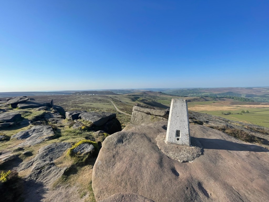
About 5 miles and 10 minutes from home, lies Burbage car park and bridge. From there, you can walk across the moor to Stanage Edge, which overlooks the back of Hathersage and North Lees wood and far into the distance, Hope Valley.

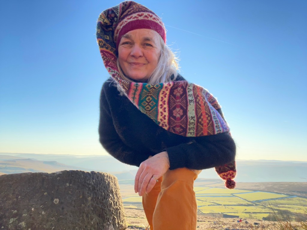
Iโ€™ve been coming here for years and years, to walk, sit, eat breakfast on Stanage Edge, chase fog, climb, or to knit during the golden hour of sunrise.   Today, was the first frost of the year and in my tiny flat in Sheffield, I knew that the moor would sparkle.  It is so close that I can walk it, cycle it but today, took the car to Burbage and walked the short distance to a trig point high above old millstones, which date back to the 18th and 19th century, used to grind grain into flour, left discarded in some once used quarry area.  I love it in this place. Everyone who lives within a 50 mile radius knows of these stones, though many lie buried under grass and moss. 

These few that lie just below Stanage, beside an old water trough are my favourites and I often visit, sitting on the same rock with my same thermos, to knit and take in the splendour of this small valley next to a city.

Anyway, last night, I grafted the shoulders of my latest Fair Isle Pullover and took it to the millstones to start knitting the neck.  It was such a beautiful morning at golden hour where every rock was casting its own shadow from the rising sun.  The short grass glistened with crystalised frost. I knitted for some time then went to Hathersage for a cheeky breakfast at Outside Hathersage cafรฉ, which was full of climbers talking of their chosen climbing routes. 

It’s a lovely place to be, to knit, to see the world.  Stanage Edge, bordering Sheffield and Derbyshire. Come visit.  Bring your knitting.

And take your tea. xxx

Fair Isle chart pattern here

https://www.ravelry.com/patterns/library/fair-isle-chart-2

Fair Isle Pullover – Two Sisters

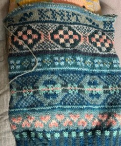
In these beautiful crisp Autumn mornings slowly opening up to warm, sweet afternoons, clear sunsets and most recently the large orb of the super moon rising, I have once again, picked up my second Fair Isle pullover which I am knitting with my sister in mind. ย ย It started off in the colours that she loves โ€“ black, grey, with highlights of navy, mustard and dark red but I was slowly sinking in the monochrome of it all.ย  Without thinking too much, the colours have become richer, using darkest navy as a full-bodied colour rather than a highlight.ย 

ย 

The pullover is, as usual with my knitting โ€“ a passion project with a story.ย ย  If you havenโ€™t read the beginning โ€“ it is here.

The most resent result is an overall slightly mismatched look, which I am completely aware of โ€“ a little like the character of a person, moving through moods.  But, on a practical level, the colour change has meant that I am now back in love with this time-consuming knit. 

I have packed this project in my backpack and unfurled it at cafes, and on Stanage Edge to watch sunsets, at Chatsworth โ€“ sitting below all the ballons taking off, and anywhere calm that I might knit and take in the surroundings and the work through my hands and  fingers.   The jumper takes on the environment within which I knit.

I am still working on the Japanese concept of Ma โ€“ the space and silence between all things and this pullover embodies that considering the space between my sister and me. ย ย It taking shape into something just as abundant as the first one but a very different visual character / experience.ย ย 

I am using my Fair Isle Pullover chart to complete the jumper in exactly the same way that I did the first โ€“ the images show the results so far. Let me know your thoughts on colour.

https://www.ravelry.com/patterns/library/fair-isle-chart-2

instagram show many more images – here

my places to knit – below a sunset, a rising moon, beside the river, or on my little patio. xx

experimenting with exposure

It is a calm Saturday, overcast with a little breeze.ย  I googled the sun and is listed to be out above the city of Sheffield later this afternoon.ย  I have wanted to try something for some time, thinking of home. My cyanotypes have mostly utilised pressed flowers and photographic negatives from when I lived in the hutongs of China, all of which rely on the sun to develop the image. I have mostly worked in the studio but have a small amount of papers that I coated last night, and they are under my nose.

Surprisingly, at 8am, a break in the clouds allowed the sun to break through and cast a brief shard of light across the floor of my tiny flat in Sheffield.ย  Alfie watches on as I place the two objects from home, made of etched glass or crystal, into the shard of light.ย  The crystal glass was Susan Halcrowโ€™s. I tear a pre prepared paper in half to experiment with what I have โ€“ a brief moment of sunshine, two objects, my floor and a little hope.ย  Here goes.

The sun gives me about 3 minutes, not long enough to develop a clear image. I donโ€™t move, the sun reappears, Alfie lies down and I hope at the wonder of what might emerge – in total I have only about five minutes of sunshine which matches my impatience.

While I wait, Iโ€™m thinking of the shadow moving across the paper, even a small amount will blur the image, if the image will take at all and then I am thinking of the movement of time โ€“ the Japanese concept of Ma, ( the space and pause between all things) that I am interested in and I watch as the sun hides again, the paper is cast into a shadow and a faint image is exposed upon the paper. I take my chance.

This is one of my processes. Experimentation โ€“ either with wool, colour, photography or cyanotype – to take a chance in the moment, with what I have to hand.

And here is the first result.

I love how the bottom of the jug is deepened in colour, I love how the etched glass stretches in pattern and a faint movement of impression.

Tomorrow, the sun is booked for some hours, I will try again. Hopefully, with a time of exposure to show movement. While, Alfie sleeps on.

Wallpaper

In 2023, when I stayed in Japan for 3 weeks, I viewed exquisite screens in Zen temples in Kyoto, and found that in a world filled with noise and speed, the Japanese concept of โ€˜Maโ€™ offered me a new perspective. โ€˜Ma,โ€™ represents the space, gap, or pause between objects, sounds, or moments. It is not about negative space, but a presence of emptiness that enhances harmony and aesthetics.  I am now constantly considering the concept of Ma, I have since resumed my craft and technical skills of wallpaper printing from my time as Artist in Residence at Sheffield Institute of Art (2019). My current body of work is delicately pressed flower botanical prints and encompasses hand-printed wallpaper, cyanotype botanical prints and the concept of Ma. I am working with my own pressed flowers which at first, I rushed to position in fear of losing the sun process to develop the print, but now I am considering, โ€˜Maโ€™ within how I work.

Here I am, on a Saturday, in searing heat, down in my little studio in Sheffield.

I am excited to share the new panels of botanical cyanotype prints that are full of risk and joy.  Firstly, I spend hours finding flowers then pressing them.  Theyโ€™re pressed under all manner of heaps of cardboard and wood until they emerge, almost flat.  I say almost because I am choosing very chunky buds and flowers like the long tall stem of a Hollyhock with varying depths of bud, seed head and stem and slim leaves โ€“ which causes issues with pressing different depths of flower. And then there are the wonderful huge fluffy yellow daisy flowers which, when pressed, and gently removed from the paper that they have stuck to, they disintegrate.  I have one long stemmed small sunflower that I hardly dare look at, squashed between paper and wood. 

The African Lilies didnโ€™t fair well either, when I lifted them from pressing, their petals fell off, so I printed them with falling petals, like tears. 

My flower cyanotypes are subject to risk and mishaps and then there is the sun.  The sun is vital in the developing process of the sheet and when breeze joins in, my carefully pressed flowers blow across the yard of Bloc Studios and I don’t know whether to collect the hard earned flowers or pick up the half baked cyanotype.

I have been in a wonderful development phase which has opened ideas to working at Carousel Studio here in the city, with their UV light box, because the sun wonโ€™t be strong enough to process the development of colour in a month or so. And, it will be out when I am at work – I cannot turn the sun on ๐Ÿ™‚ The strength of the sun and the length of time of shine on the developing cyanotype, all make a difference. Here, you can see details of sections that worked through lengthy sunshine exposure.

below, the print is slightly lost through less exposure, but I also like the ghost like finish

I am excited by the results and my process and new ideas from my cyanotype prints.  If you have been following me for some time, you may remember my first wallpaper prints which were Shetland lace patterns, and are here in 2019, when I wallpapered the inside of an abandoned croft house in Bressay as a testament to the women knitters who one lived there.

I planning further development of my process in printed wallpaper to include lino cuts and silk screen printing and gold leaf. Maybe even golden petal tears. And I will be showing the panels in Flower shop and concept shop windows.


Let me know your thoughts ๐Ÿ˜Š

The space between all things

My field of Art has been knitted textiles for a long time, including a Masters in Knitting at Nottingham Trent University 2016 โ€“ 2018.  I often placed my knitted textiles into the landscape to create site specific photographic art which explored the social histories of women and the making of knitted articles.  

I am currently working on a wall based knitted jumper piece called, โ€˜I Cannot Reach You.โ€™  It is taking into consideration the Japanese concept of ้–“ ๏ผˆMa)   – the  silences and the spaces in between all things, and relating it to the relationship between me and my sister.  

I would like to learn about the meaning and concept of the Japanese word Ma ้–“   and relate it to the way in which I experience life, donโ€™t you think it would make life fuller? We do not have this word or meaning in England and to look at the spaces is as interesting as looking at the solid things. 

I would like to explore what โ€˜Maโ€™, looks like to me, in the space between all things and use textiles and print to express my new understanding of this. If you are Japanese and have and wisdom to share, please do.

I have recently started to develop Cyanotype prints using pressed wild flowers to create images that are often  half present, a little ghostly.  I am looking at making wallpaper strips to utilise the cyanotype printing process to create the deepest blue papers with hints of British wild flowers, to look a little at the spaces in between in the prints.  Yesterday, I made to sample strips out in the yard at bloc studios, where I have a small space to work.

Currently, I am experimenting and, as you can see,  the process is open to risk and failure, but the two wallpaper strips are becoming more loved by me because of the spaces in between. One has less impressions of the flowers than the other due to both my impatience of removing the flowers and due to the wind shifting them but maybe just pure blue is lovely enough with a hint of a story of flowers in smaller areas โ€“ less โ€˜gilding the lilyโ€™ to speak.

Today, I hung the papers on my wall at home to really look at what is present and what is a faint mark only, and what is in the spaces.   I like the results, in some way, they remind me of the Japanese screens that I saw in the temples in Kyoto. But maybe I need to make them more sparse.  Let me know your thoughts. 

If you would like to join me in my next online workshops, they are in the link here.

If you would like to contact me about hand printed cyanotype wallpaper strips, please do so ๐Ÿ˜Š

If you would like to follow me on instagram, where there are lots more images, then, I am in the link here