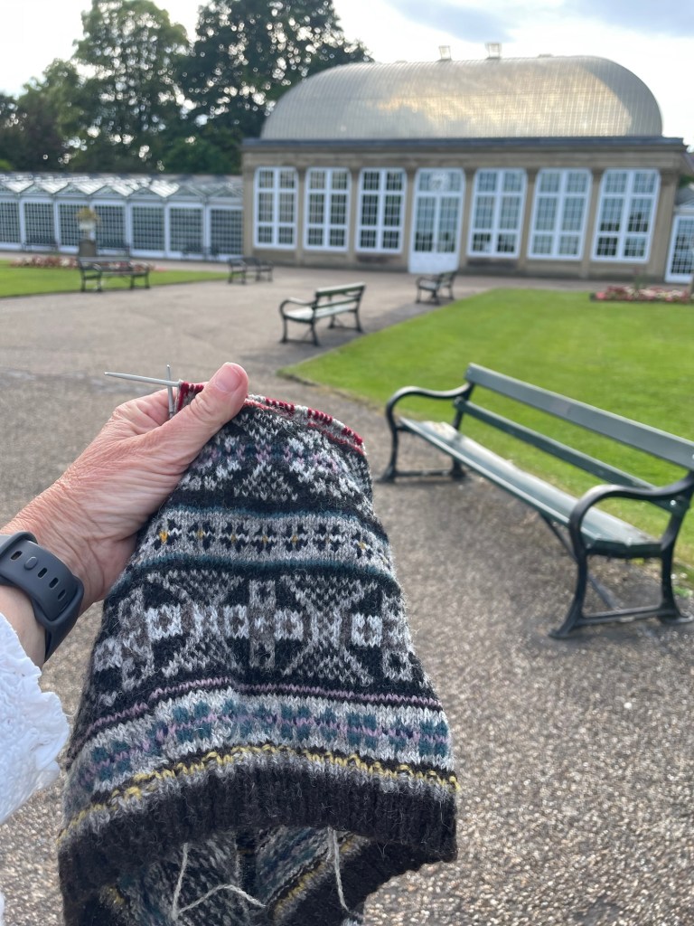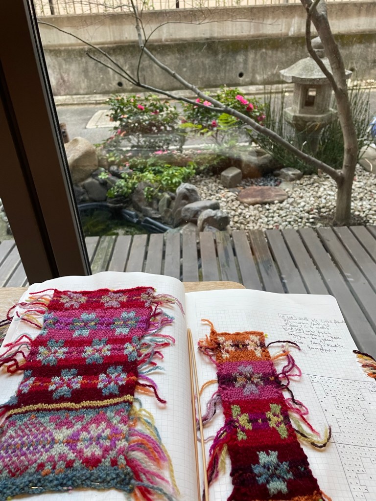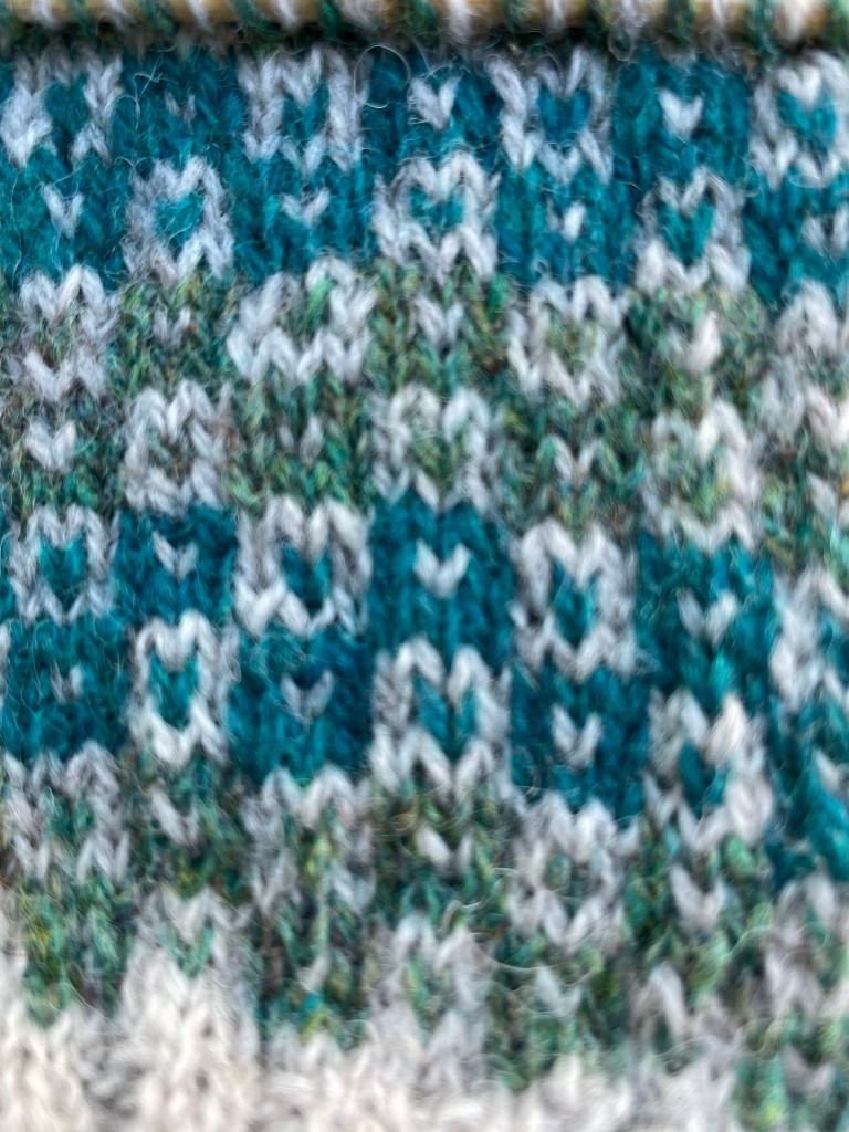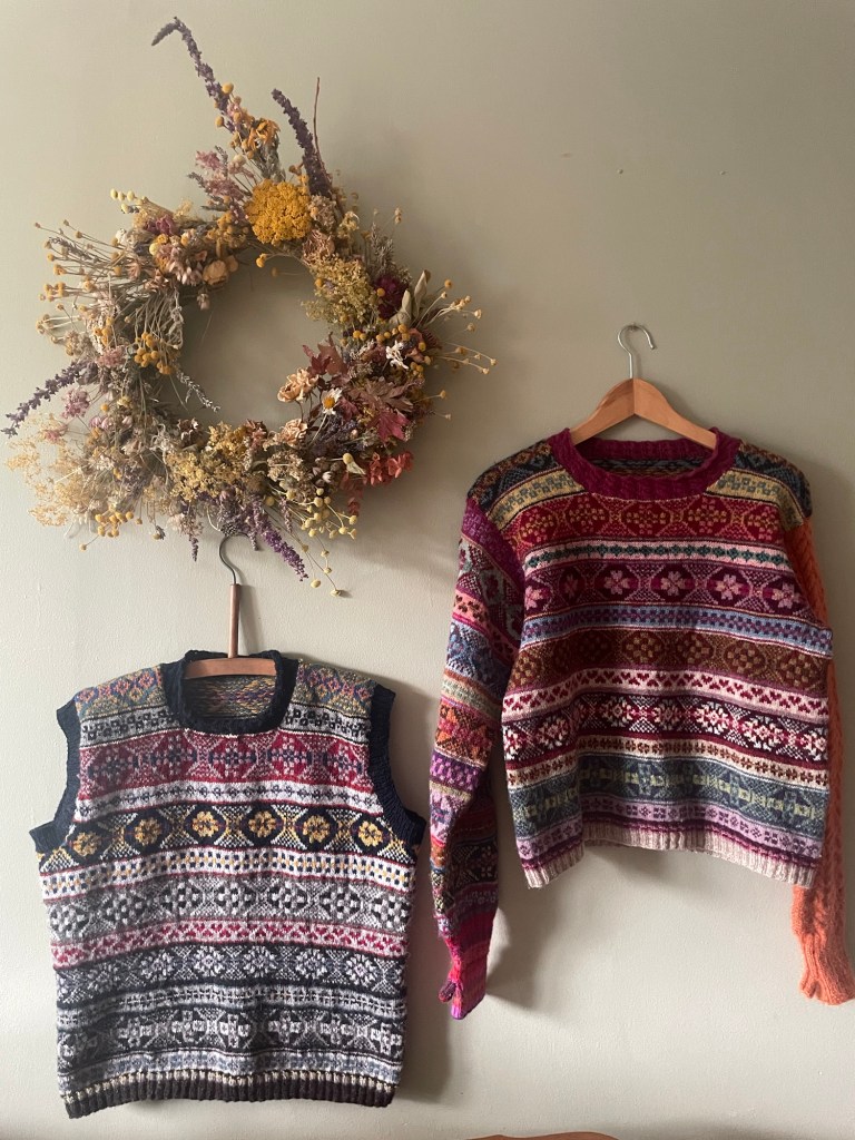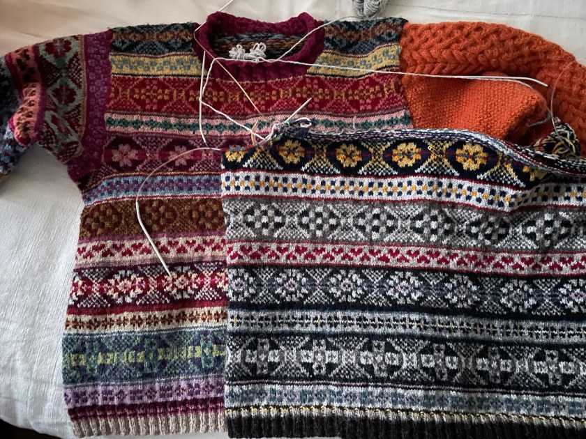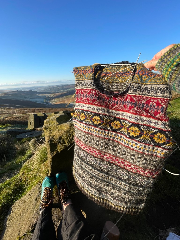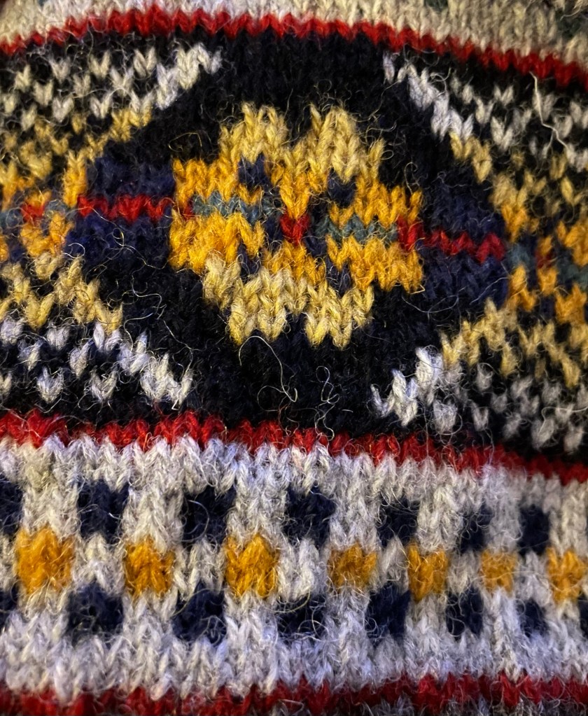
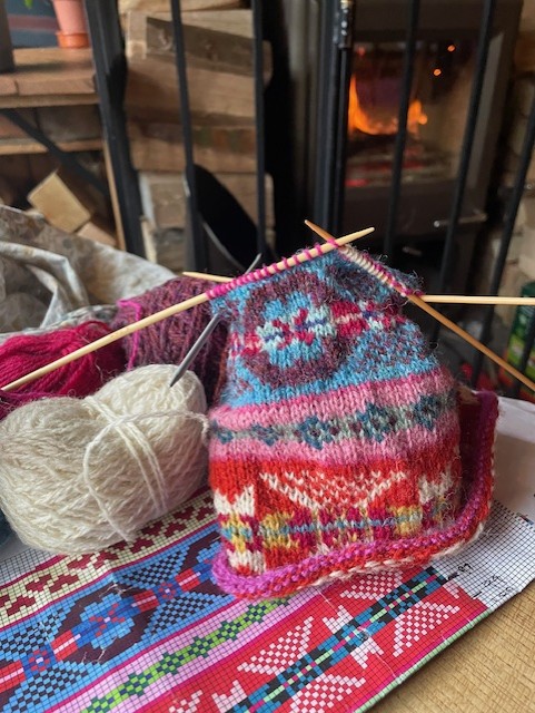
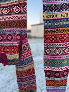
I am really excited to bring you my latest knitting pattern design – My Fair Isle Hat Scarf – which has been a complete labour of love to create this twelve page pattern containing a complete guide of size, gauge, colours and all motifs used in this hat. There are 10 Full colour charts, over 8 pages, showing clear motif and colour layout, ranging from an A4 page full colour overview of the full bands of motifs making up this pattern – to additional pages of magnified, larger scale sections of the charts in order for you to see them easily.
Here is the pattern, if you want to go see https://www.ravelry.com/patterns/library/fair-isle-hat-scarf
Additional to the Fair Isle colour charts, there are written and photographic instructions and I have included a full Sanquhar alphabet and numbers 0-9 because I knitted words into my piece and the alphabet chart enables you to do the same or personalise your own work, with your own meaningful words, names or dates knitted into your hat so that you can make it your own. You can also add dates.
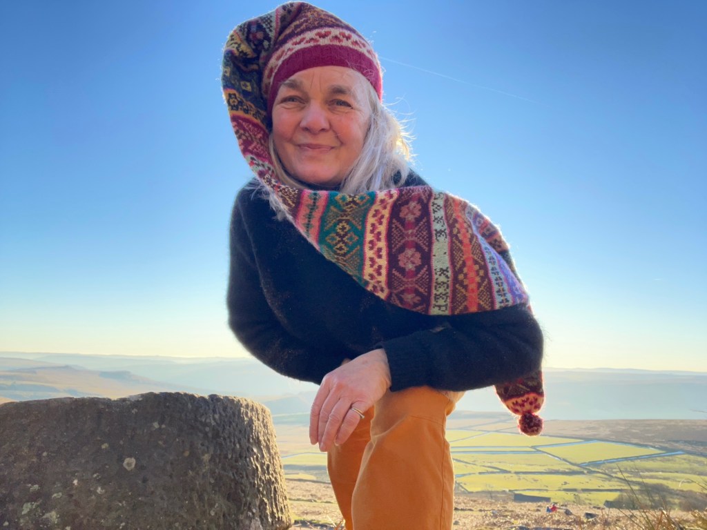
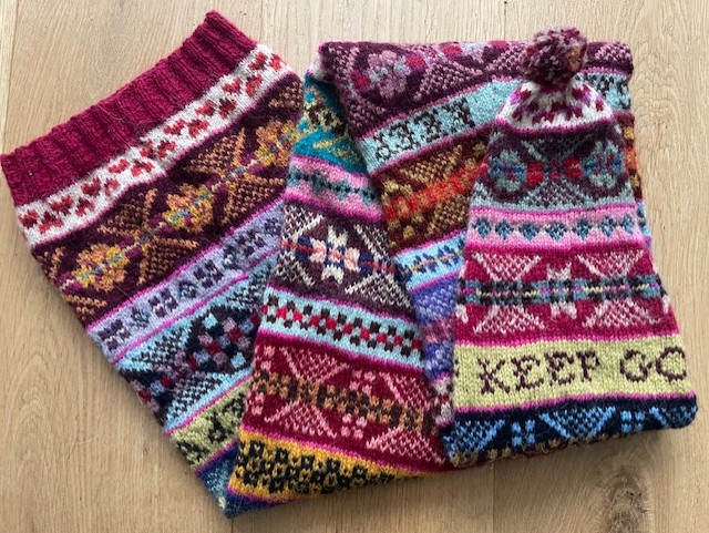
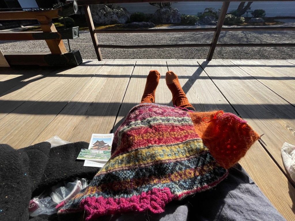
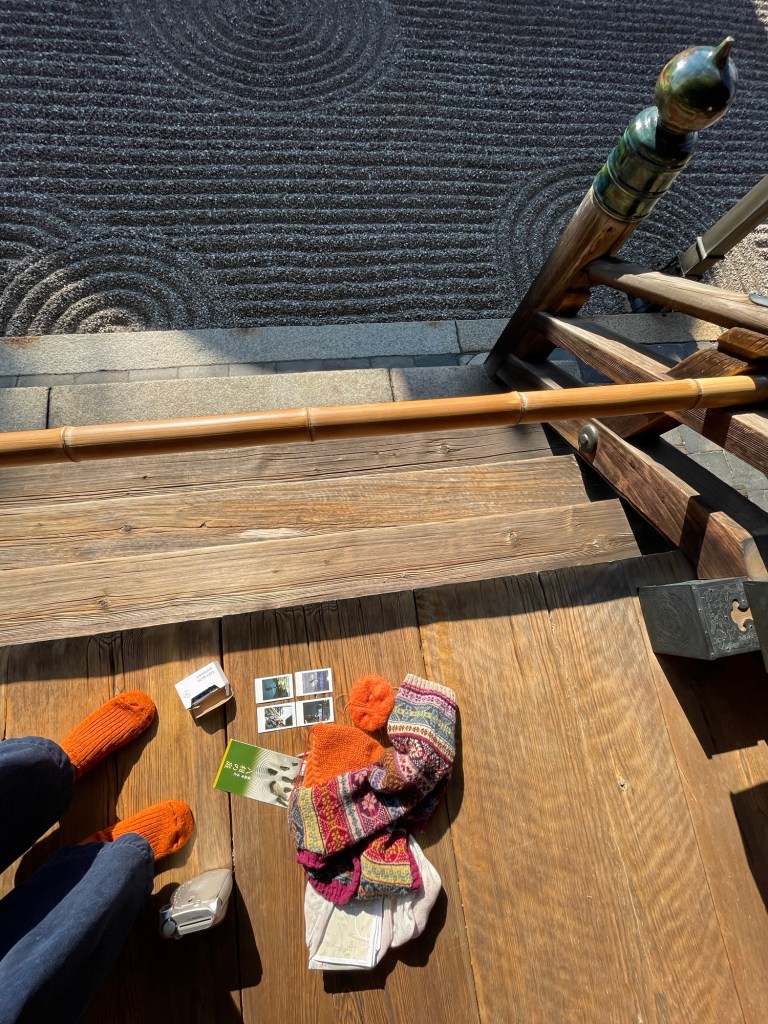
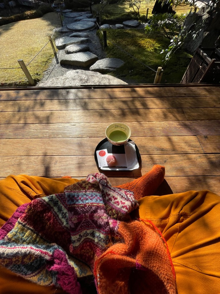
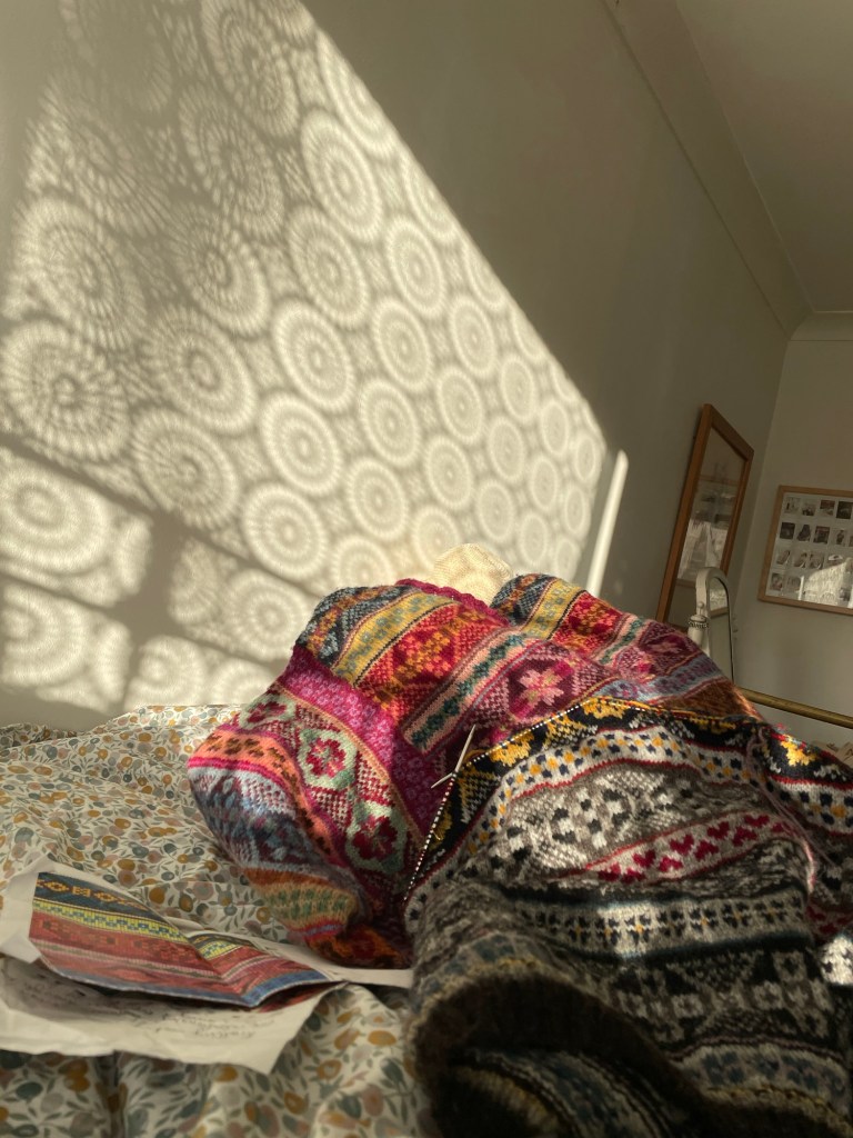
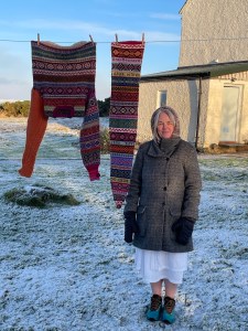
This Fair Isle long Kep/ scarf, is a bright, fun, functional, practical, colourful, wearable long hat, designed using large traditional OXO and smaller peerie Fair Isle motifs to create a unique long hat. It was originally designed as an exhibition piece by thinking how I can connect to my sister. My own hat has expressive words knitted into it. They’re from individual text messages sent to me by my sister – KEEP SAFE… KEEP WARM… JUST KEEP GOING… Remember, you can add your own words to make it your own creative work by using the alphabet chart included in the pattern.
KEEP WARM, KEEP SAFE, and JUST KEEP GOING, are individual text messages sent to me by my sister, they are short simple and caring, meant for me but also act as reminders to herself.
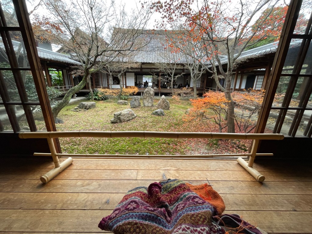
For the textile art exhibition, I titled the long Fair Isle hat scarf, ‘Trying to Just keep going’, but, it is also a wearable knitted artwork, using intricate, colourful, Fair Isle motifs to create a long hat /scarf. You can easily follow the pattern and make your own artwork
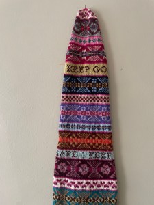
My sister and I were born in the 1960’s. I finished this hat/scarf as a tribute to her – to keep warm, safe and to just keep going. There is some kind of paradox between the colourful, cosy, knitted piece and the texted words, which could seem irregular on a knitted hat.
The words invite the viewer to read the piece through words and could raise the question of what words in knitwear can mean to them.

On 5th Jan, I walked in the snow wearing both the ‘Trying to Keep Going’, hat scarf and the, ‘I Cannot Reach You’ jumper – I thought of the words knitted into the piece – KEEP WARM, KEEP SAFE, JUST KEEP GOING, and I felt them all for myself, at that moment.

The below words have been sent to me by Mary Mullens, who kindly test knitted this piece. I asked Mary if she would like to test knit because she has attended my online workshop to understand how to blend colours, tone, contrast and pattern as well as knitting some of my patters but more than that, Mary has developed experimental skills and has been up for learning along the way. She has very much enjoyed knitting this hat/scarf – here are her words. She is happy to share them and her story shows that we do not know what people are going through and how the stabilising qualities of knitting help us with our mental health. Me included.
Test Knit of Long Kep for Tracey Doxey 2025 – Mary Mullins.
I have been knitting since 1986 when I had my daughter. I continued for a few years and made jumpers for my children. I then found life got in the way and also living with an alcoholic husband, my mental health did not help.
After many years alone and not really thinking of marriage, I met my current husband Mark and we married in 2018. He became critically ill from covid 19 in 2022 and was on a ventilator in ITU for 2 weeks, he needed emergency open heart surgery as the virus destroyed his valves. He then had a stroke while under anaesthetic and fractured his back. He developed seizures and lost most of his mobility.
As a result of this I was off work for 2 months and when I returned, I went back part time so I had time to visit him in hospital in London’s St Barts.
I don’t know why but I decided to knit again. It helped my mental health and I took it on with a vengeance. I have knitted 7 jumpers, numerous hats, 3 cowls, baby clothes and toys including Bag Puss and an Elephant. These items made great Christmas and birthday Presents as we had very little income due to loss of husbands earning and mine being cut in half.
Somehow my addictive personality has established a huge stash of wools of all kinds and gathered all the needs that I needed.
I also have hundreds of patterns that one day I hope to knit.
When Tracey asked me if I would like to Test Knit her new project, I was amazed to be honest. I never imagined I was good enough to do it. I have enjoyed this project immensely and it has really been a challenge as I was not aware of just how much feedback I was meant to give regarding the pattern ect.
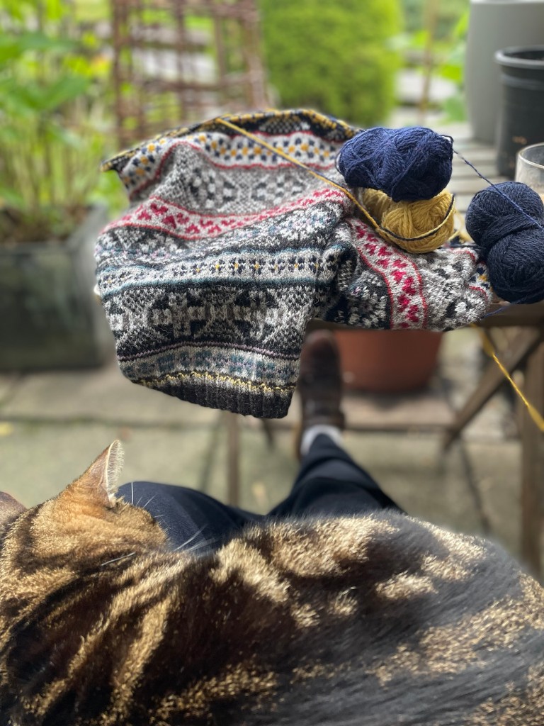
I was a little nervous but embraced it in my usual enthusiastic way and dug out every strand of Jamison’s wool and wanted to use as many colours as I could. I found I had an extensive stash which fills 3 boxes and started straight away.
When thinking about the words I wanted to use in the kep I decided on “Lots of Love and Hugs”, I have conversations by wattsapp with my mum daily and we always close the messages this way. For the 2nd row of words, I am still thinking what to do. I have plenty of quotes that are especially meaningful to me so thinking keps on 😊
I have been using the tips I learnt in Tracey’s workshop for the colour choices to help with the sets of colour for each band.
Jamison’s do such lovely colours and there is a huge choice. One day I would like to have a ball of every colour.
This journey has been an amazing experience and I was chuffed to see my name and a photo of my work at the end of the pattern.
Thankyou Tracey for giving me this opportunity and all the very best with the launch.
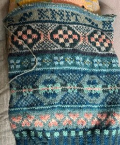
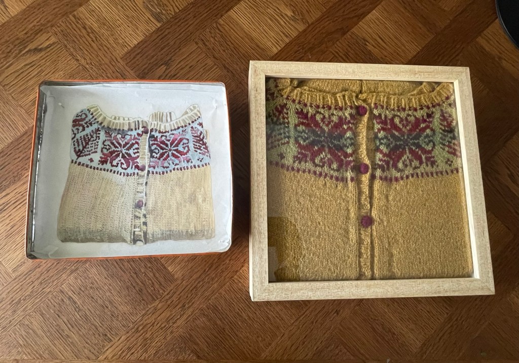
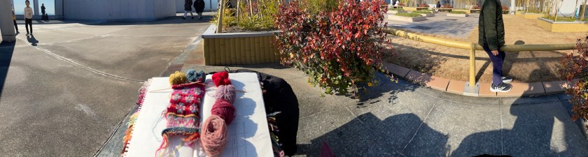
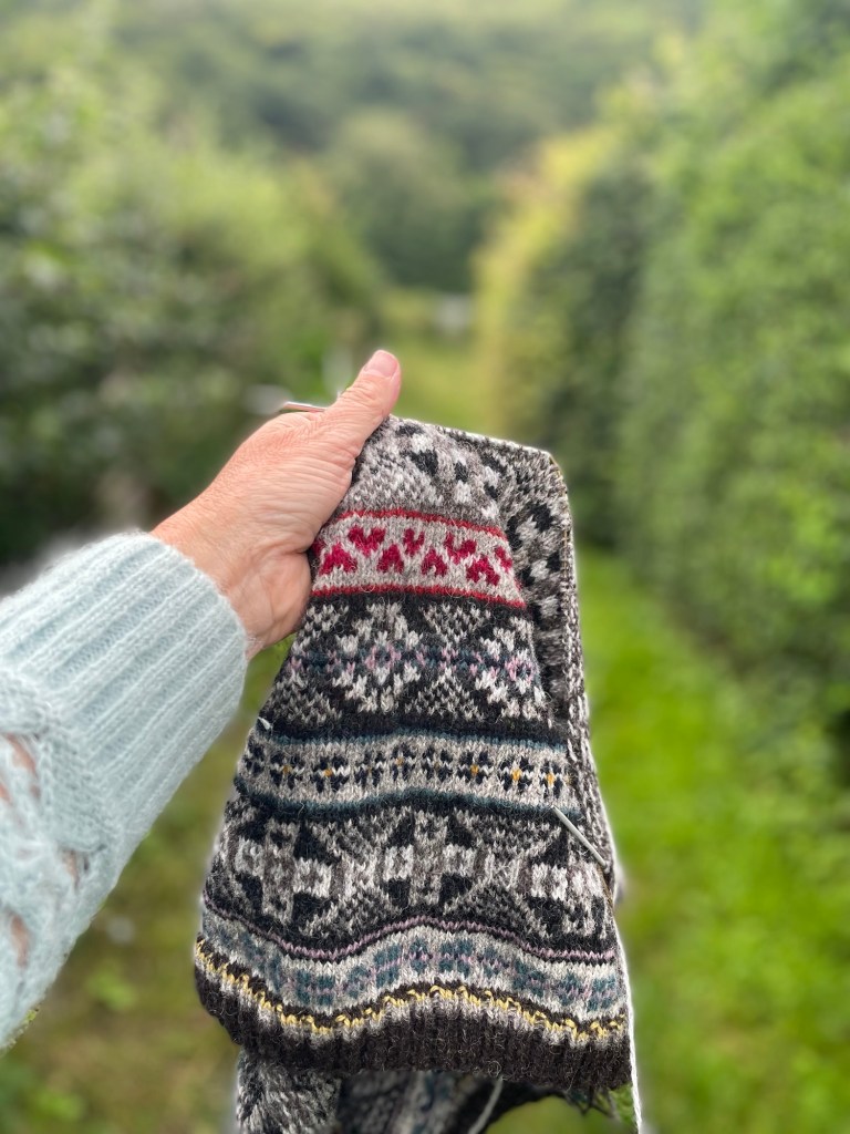
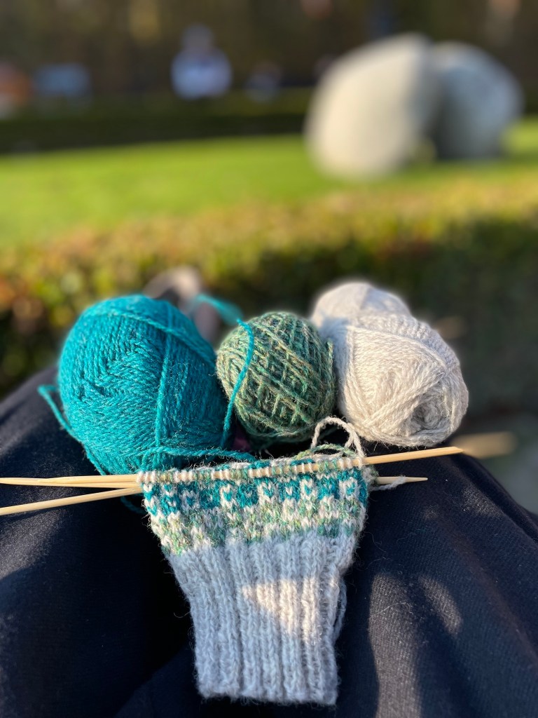
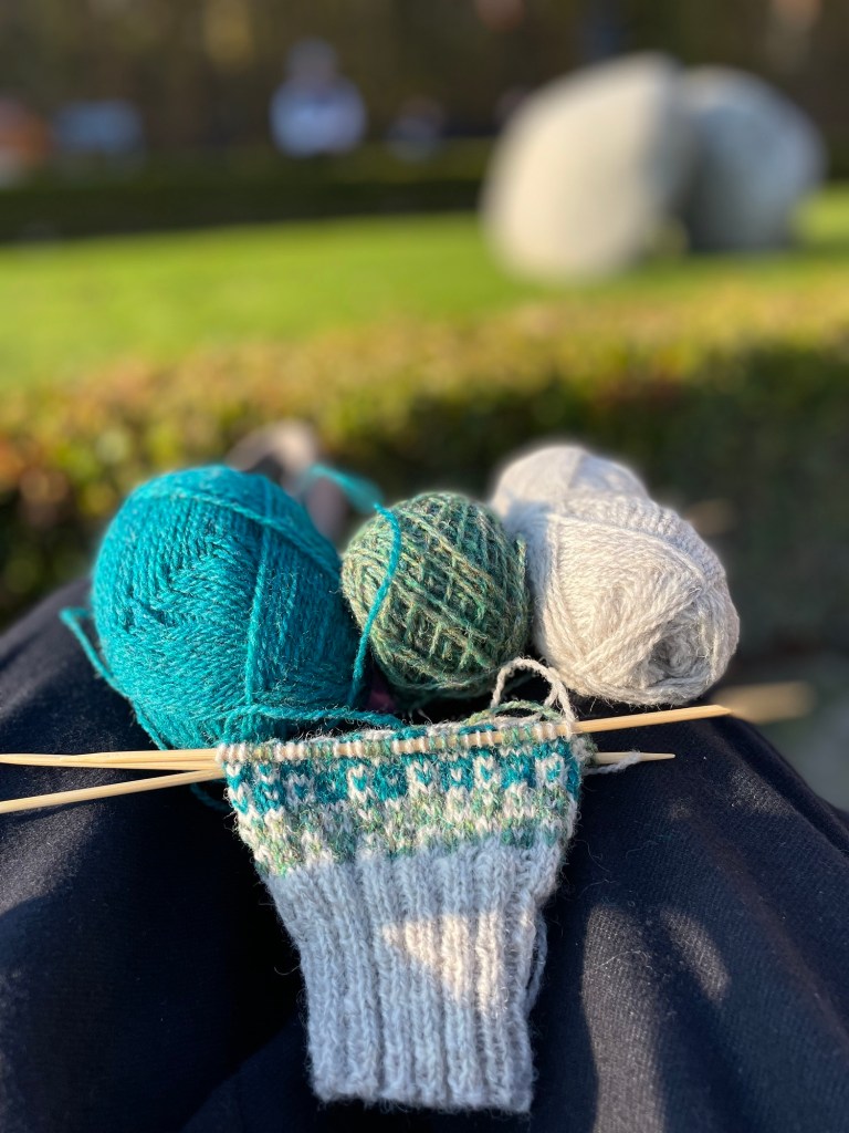
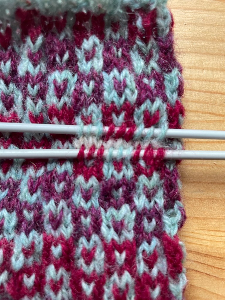
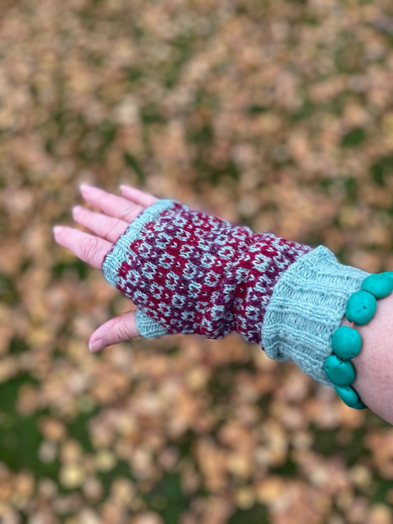
Here are some images of Mary’s test knitting for the long Fair Isle Kep scarf.


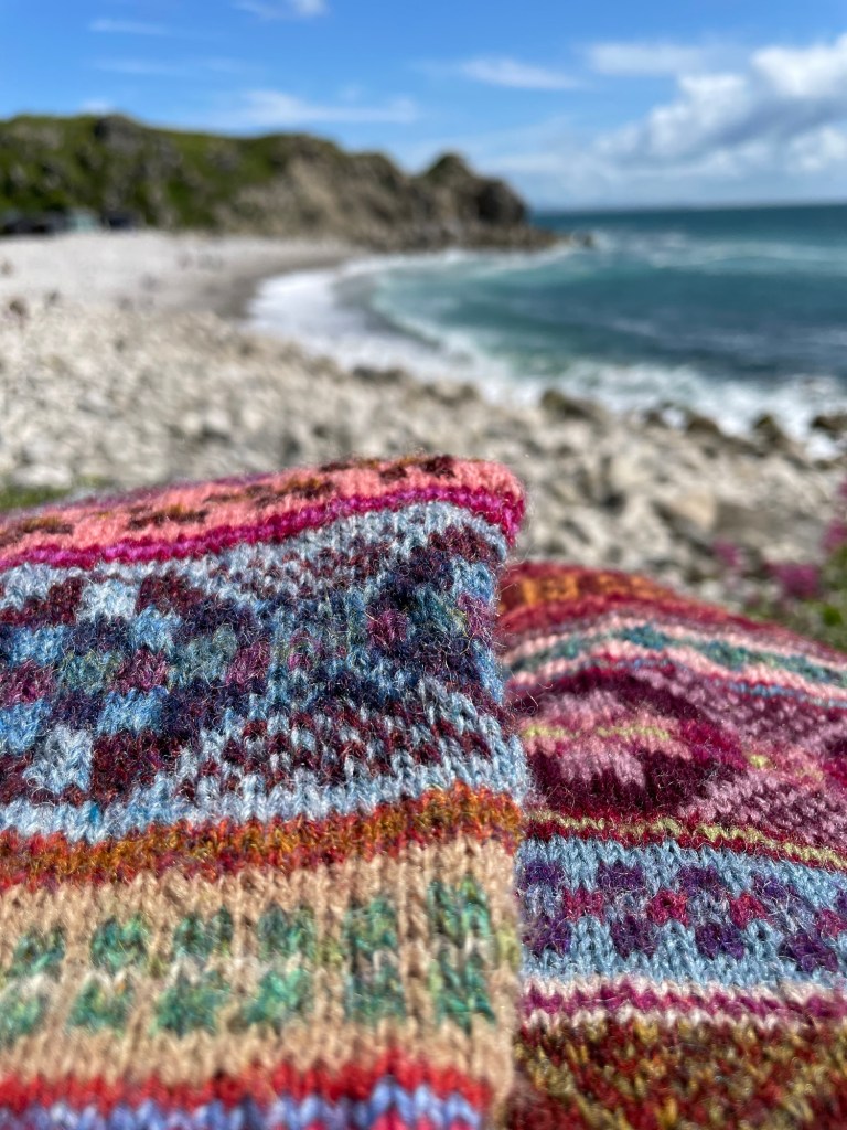
And here is Judy MacGlaflin’s test knit image. A great big thank you to both Mary and Judy for knitting this piece. I will update their test knit images in a future post.